Counter Mats · 6 min read · October 3, 2026
How to Design Artwork for a Custom Printed Counter Mat
A counter mat isn't a poster laid flat. It's read upside down by half the people near it, partly covered by a card terminal, and trimmed with rounded corners. Design for that.
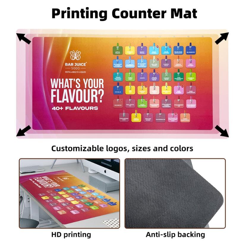
Most artwork for custom printed counter mats starts life as a poster or a social post, resized to fit. Then it arrives at the counter and the problems show up: the headline faces the cashier, the offer price sits under the card terminal, and the logo in the corner has been clipped by the rounded edge.
None of that is a printing fault. It's a layout made for a wall, used on a counter. Here's how to set up a counter mat design so it works where it's actually used.
The short answer
Design a counter mat to read from the customer's side, keep everything important inside a safe zone away from the edges and rounded corners, leave the area under the card terminal or register empty, and supply print-ready files at final size with bleed. Then check the free digital proof at actual size before approving.
1. Decide who reads it, and from where
The customer stands on one side of the counter, the staff on the other. The mat's job is almost always to talk to the customer, so the artwork should read the right way up from their side.
Then think about distance. Someone queuing a step back sees the mat at an angle; someone paying is looking almost straight down at it. Put the one message you need them to see, the offer, the product, the QR code, in the part of the mat nearest the customer's edge.
2. Map what will sit on the mat
A counter mat shares space. Card terminals, pens, product samples and phones end up on top of it, usually in the same place every day.
Ask the store (or check a photo of the counter) where those things go, and keep that zone free of text. A busy pattern or a brand colour is fine under a terminal. A price isn't. If the mat also works as a mouse pad on a reception desk, keep the mouse area plain too: a smooth, low-detail zone tracks better and looks cleaner.
3. Bleed, safe zone and rounded corners
These are standard print rules, with one counter-mat twist.
- Bleed: if the background runs to the edge, extend it about 1/8″ (3 mm) beyond the finished size on every side, so there's no white sliver after cutting.
- Safe zone: keep text, logos and contact details at least 1/4″ (6 mm) inside the finished edge. On larger mats, give them more room than that; it looks better and survives handling.
- Rounded corners: counter mats are usually cut with rounded corners, which trim more off the corners than a straight edge does. Don't put a logo or small text tight into a corner.
- Edge finish: ask whether the edge is plain-cut or finished, and keep detail clear of it either way.
4. Text size and contrast for a counter
Small text is the most common counter mat mistake. A line that reads easily on a laptop screen can disappear on a 12″×24″ mat seen from standing height.
Keep it short: a headline, one supporting line, the offer. Go big on the headline, avoid thin script fonts for anything that must be read, and put dark text on light backgrounds (or the reverse) rather than mid-tone on mid-tone. If a store uses bright overhead lighting, a matte finish cuts glare; we print counter mats in matte or gloss, so say which you want.
5. QR codes that actually scan
QR codes on counter mats are popular for menus, loyalty sign-ups and product pages. They only work if a phone can read them over the counter.
- Make the code big enough to scan from where the customer stands. Around 1″ (2.5 cm) is a practical minimum; bigger is safer.
- Leave a clear, plain margin around it (the quiet zone) of at least four of the code's small squares.
- Use dark modules on a light background and don't place the code under a gloss highlight or near the edge.
- Point it at a short, stable URL you control, so the mat still works if the campaign page changes.
- Test-scan the digital proof at actual size before you approve.
6. The files to send
- Artwork built at the finished mat size, plus bleed.
- Vector logo (AI, EPS, SVG or a vector PDF) wherever possible.
- Photos at roughly 150–300 dpi at final size. A small web image stretched to 18×36 will print soft.
- Colours in CMYK, with any brand colours that must match called out.
- Fonts outlined or embedded in the PDF.
- A note of which edge faces the customer, and any zones to keep clear.
7. Insert-window and magnetic mats are different
If you're ordering an insert-window counter mat or a magnetic flip-top mat, the changeable artwork is a separate printed sheet, so design it to the insert size, not the mat size. The permanent part, the frame or border, can carry the brand. Getting the insert size right is covered in our counter mat sizes guide.
FAQ
What file format is best for counter mat artwork? A print-ready PDF at final size with bleed, with the logo in vector form and photos at about 150–300 dpi at final size.
Can you print our logo and promotion in full colour? Yes. MatCore prints full-colour, high-resolution artwork on the PVC top in a matte or gloss finish, and confirms the layout with a free digital proof before production.
Do you help if our artwork isn't print-ready? Send what you have and the size you need. The free digital proof is the point to catch problems such as low resolution or text too close to the edge, before anything is printed.
What are the lead time and MOQ? Stock designs typically ship in 7–15 days and custom orders in 20–30 days; MOQ depends on size and format and is confirmed in the quotation. Send us your artwork to start.
This article is general industry guidance. For advice on a specific project, contact our team.
Related products