Logo Mats · 6 min read · October 9, 2026
How to Prepare Artwork for Custom Logo Floor Mats (So the Mat Matches Your Brand)
Most problems with custom logo floor mats start in the artwork file, not the factory. Here's what to send, how to set colours and borders, and what to check on the proof before you approve.
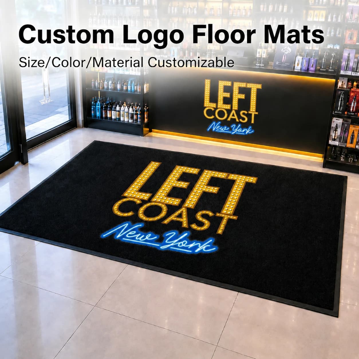
A logo that looks crisp on a business card can come out soft on a floor mat. The pile is textile, the mat is viewed from five feet up, and there's a rubber border eating into the edge. None of that is a printing fault. It's a file that was made for paper.
If you're ordering custom logo floor mats, ten minutes spent on the artwork saves a round of proofs and, occasionally, a reprint. Here's what we ask for and why.
The short answer
Send your logo as a vector file (AI, EPS or vector PDF) with fonts converted to outlines, plus your Pantone references. Keep text large and lines bold, leave a margin inside the rubber border, and approve the digital proof at full size before production. Raster images should be at least 300 dpi at the printed size.
1. Send vector, not a screenshot
A vector file (AI, EPS or a PDF saved from Illustrator) scales to any mat size without losing sharpness. A JPG pulled from your website was made to look good at a few hundred pixels wide; stretched to a door mat, the edges turn into steps.
Two small things prevent most delays. Convert all text to outlines, so a missing font doesn't swap your typeface. And if the artwork includes photos or textures, send them as high-resolution images at 300 dpi or more at the size they'll be printed.
Only have a JPG? Send it anyway. We can often redraw a simple logo, but you'll need to check the redraw carefully on the proof.
2. Give us Pantone numbers
Screens show colour with light. A mat shows it with ink on nylon pile. The same RGB file looks different on every monitor, so "the blue on our website" isn't a reliable target.
Pantone references are. We print in full colour by CMYK inkjet or ChromoJet and match to your Pantone numbers. For bulk orders, we produce a pre-production sample so you see the real colour on the real material before the run starts. If your brand guidelines list Pantone values, send that page.
3. Design for distance and pile
People read a floor mat from standing height while they're walking. That changes what works.
Make text bigger than feels natural. A tagline that's comfortable on a letterhead disappears at the door. Keep strokes bold: hairlines and thin serifs soften once they're printed on pile, because each tuft spreads the ink slightly. Full-colour printing handles gradients and photographic images well, so you don't have to flatten a complex logo; just keep the important parts (the name, the mark) clear and large.
A quick check before you send: print the design at full size on paper, or scale it to fill your screen, put it on the floor and look down from standing height. If you have to bend to read it, so will your customers.
4. Leave room for the rubber border
Most printed logo mats have a plain rubber edge around the printed area. On our nylon-and-rubber mats it's around 15–20mm. That border keeps the mat flat and stops it sliding, but it's not printable.
Keep logos and text well inside it. Artwork that runs right to the edge of the file either gets cropped by the border or squeezed to fit. If you want colour to the very edge of the printed area, extend your background beyond the trim and keep the important elements centred.
5. Think about orientation and dirt
Lay the design out so it reads correctly for people walking in. Put the logo where eyes land first, not hard against the front edge where shoes scuff it.
And pick a background that forgives traffic. Dark or busy grounds hide the walking path far better than a pale solid. A white mat with a small logo looks beautiful in the mock-up and grey within weeks at a busy door. Our post on how long printing lasts on a logo floor mat covers what fades and what doesn't.
6. Check the proof like a buyer, not a designer
Before production you get a free digital proof showing your artwork on the mat at its real size. Check four things on it: the spelling (especially names and web addresses), the size and orientation, the space between artwork and border, and the Pantone references listed against each colour.
Approve the proof, not the mock-up. A mock-up is a sales image; the proof is the production instruction.
A note on trademarks
Only send logos you own or have permission to use. If you're a reseller or agency ordering mats for a client, get the client's sign-off on the proof. Some brands restrict where their logo can appear, and a floor mat is one of the places they sometimes say no.
Ready to send?
Email the vector file, Pantone references, mat size and quantity, and where the mat will be used. We'll come back with a proof. Stock items typically ship in 7–15 days and custom orders in 20–30 days once the proof is approved.
Browse the logo mat range or send us your artwork. Ordering counter mats too? The counter mat artwork guide covers their differences.
FAQ
What file format is best for custom logo floor mats? A vector file: AI, EPS or vector PDF, with fonts converted to outlines. Raster images should be 300 dpi or more at the printed size.
Can you match our exact brand colours? We match to your Pantone references and, for bulk orders, make a pre-production sample so you can check the colour on the real material.
Why does my logo look different on the mat than on screen? Screens display colour with light, mats with ink on textile pile. Pantone references and a physical sample are the reliable way to match.
Can I put small text on a logo mat? You can, but it often goes unread. Mats are read from standing height while walking, so keep text large and strokes bold.
This article is general industry guidance. For advice on a specific project, contact our team.
Related products